One of the latest projects for a brand specializing in Smash Burgers
When we started working on this brand and received the brief from the client, it was clear that they intended to create a burger sandwich with very high-quality ingredients and a unique appearance that would compete with multinational brands while maintaining their standards.
This placed the responsibility on us to ensure that the brand's look and feelings, as well as the packaging design, are on the same level in order to attract attention and position it correctly within the market.
Additionally, one of the challenges of this project is that the brand owners are engineers, and working with engineers is often difficult because they focus heavily on the deep details.
At Lasheen, after studying the brief, we decided to create a logo that would serve as an icon.
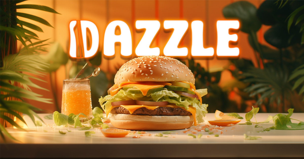
We incorporated the letter "D" as the icon to make it distinctive and recognizable as the brand expands and grows both nationally and globally. The idea behind the letter "D" is that it represents a bun with a burger inside, and the cheese melting out of it, but in a vertical shape.
We chose pop colors to make it catchy, bold, and fresh. We didn't want to be too stuck on the common red or yellow colors that are prevalent in this industry, so we merged them together. We also wanted to convey the meaning of the word "dazzle," which is captivating and radiant, through some illustrations that say "boom" and the presence of trendy and funky characters that give the impression that the whole concept is dazzling.
We started the visual branding from the logo all the way to the packaging materials, staff uniforms, and menu, which are currently being used in the soft opening on in Dokki - Egypt
We wish the project success and hope that you like it.


